Why You Can't Highlight or Underline Text in After Effects
When you think about it, it's pretty weird that Google Docs beats Adobe in text formatting features. Text is such a crucial part of design and motion design. And highlights and underlines seem to be a basic part of text formatting. After Effects has neither.
It's not just After Effects missing features. While Photoshop, Illustrator, and Premiere do have underline -- they're all missing a highlight button too.
After adding features like highlight and underline to After Effects with Type, I've received dozens of comments expressing surprise these features aren't built-in. Here are three theories on why Adobe hasn't implemented them.
The Color Problem
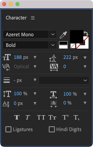
When highlighting in Google Docs, users choose the highlight color. Where would you add these color controls? The Character panel is already crowded.
 Adding an additional color box might get people mixed up with the text color. Adobe might prioritize overhauling their entire color management system before adding text highlighting.
The Stroke Problem
Other Adobe programs have underline buttons but lack full functionality.

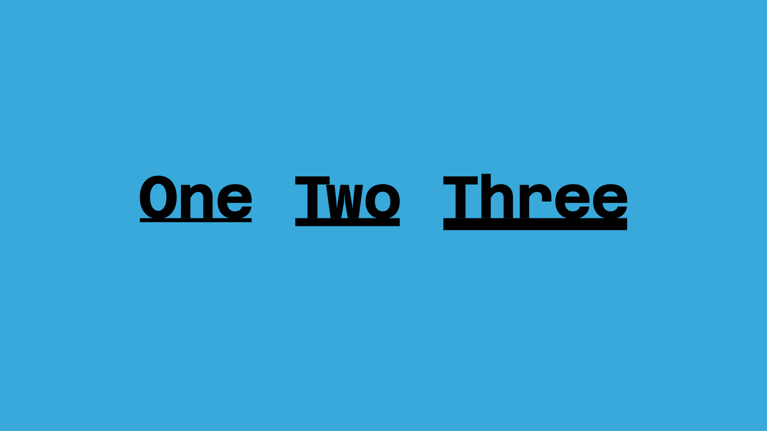
In design, lines are typically strokes. And strokes come in different widths. Questions arise about controlling stroke width and spacing between line and text -- complex design problems beyond a simple button.

The Animation Problem
The biggest obstacle involves animation. Google Docs doesn't address animation, but After Effects users would likely want to animate highlights and underlines. What if you wanted to highlight or underline multiple sections of the same text layer? This requires managing keyframes and handling multiple highlighted text sections -- potentially requiring separate shape layers, which creates poor user experience.
The Type Solution

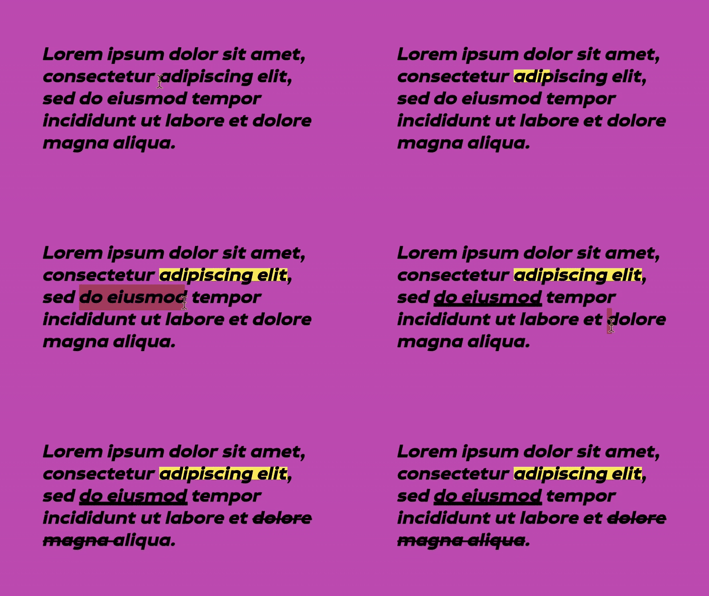
Type addresses these gaps, offering highlighting, underlining, blinking cursors, number formatting, and text splitting capabilities.
